
My latest project is simply called “Sweet”, the name of a girl who turned 18 this month. This piece was commissioned as a birthday present for her by her aunt and uncle. The brief was to make a scene capturing flowers in a riot of colour. There are eighteen main flowers in this work, some small (about 50 pence size), some much bigger (about 6.5 cm in diameter), like the three main daisies. I chose a dusty pink background as the support for the foliage in 3 tones of green. I thought this would create a vibrant warmth. The plant stems are in a dark shade of cream, which are composed of two layers of quilling paper strips giving them enough thickness.

Here are the main flowers in detailed shots. The daisies were the most time-consuming to do as it took two hours to make each one. Each petal had to be hand-cut into shape (18 petals for each flower), then ‘fringed’ using a ‘slash-cut technique’ with tiny scissors to give them depth and dimension. Each petal is then laid on top of each other. A fringed strip of green paper is made using scissors (I don’t own a fringing tool, never have done). I prefer to make the fringes individually as I can then control the widths of each fringe (very narrow if I want it fragile and dainty or wider if I want it less ‘fringe-looking’). The fringe strip is then coiled very slowly to form a barrel or cylinder. The fringes are then unfurled or opened. This piece then gets glued onto the centre of the flower. The rest of the flowers are what I call “folly flowers” as they are totally imagined and not at all real. I can go on forever with the permutations on these folly flowers. It’s a separate specialism on its own, I think, just coming up with different combinations of colour, shape and dimensionality.
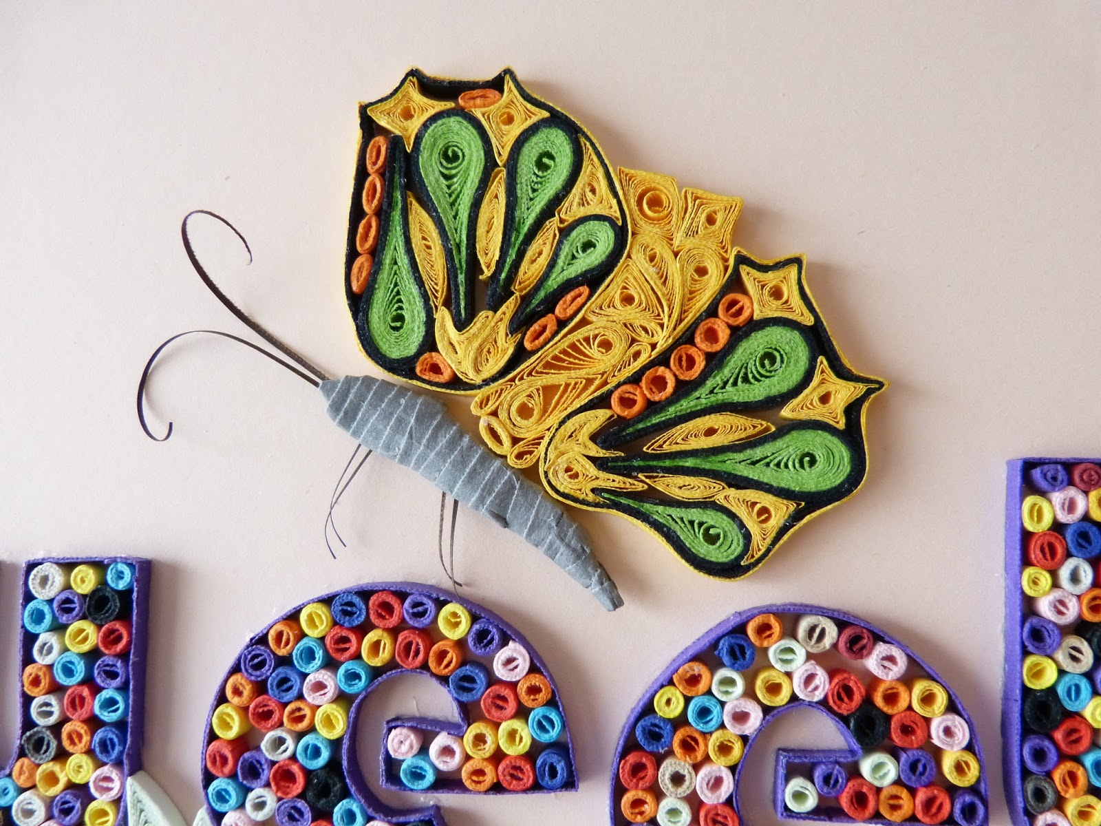
The yellow butterfly was conceived to complement the purple. Purple is Sweet’s favourite colour and is thus the central colour of the piece. This little insect is several hours of work to get the right wing shape. The coiling of the proboscis is quite easy and I enjoyed doing this, as well as those fragile legs.
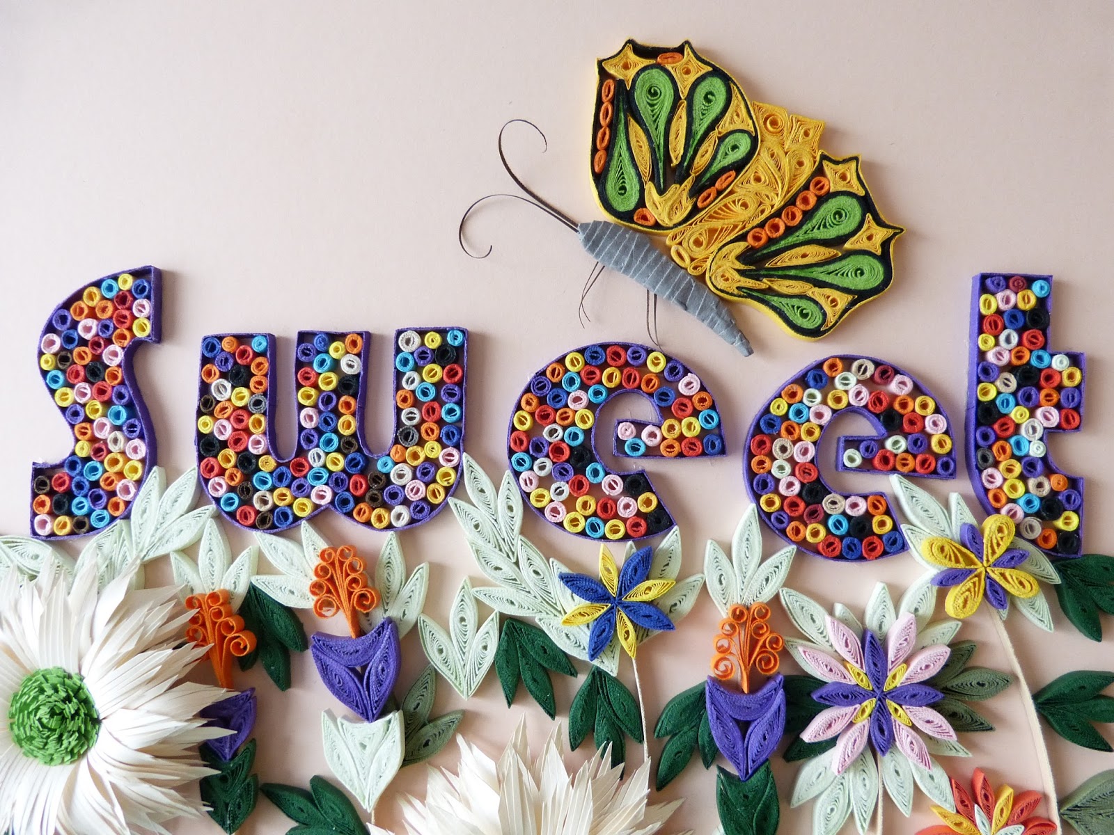
The word SWEET is in a Bauhaus typeface. This seems quite at odds with this piece as it is more traditional and a bit rococo as opposed to minimalist modernism. I chose this type face, however, for its depth and width. It gives much ‘blank’ space which created an opportunity for ‘colour-filling’. A great deal of my time was used to make these little coiled cylinders that look like sweets. They are coiled one by one and then glued in a particular way so the colour distribution appears random but pleasing to the eye. Each of them is 0.5 cm in diameter. Very fiddly work indeed. But the visual rewards are worth it!

The work framed in wood painted in matte purple. The paint colour matches the paper colour exactly. Kudos to Alec, once again for an excellent frame!
